Gamifying Ecosia
Designing a gamified Impact Dashboard that connects individual user activity with real-world environmental outcomes, driving retention and engagement.
In 2024, I explored how Ecosia — the non-profit search engine that plants trees with ad revenue — could increase user engagement and retention. Ecosia’s growth relies on sustained search activity: the more people search, the more trees are planted.
However, research and business data revealed a gap between user intention and long-term engagement. Users cared about sustainability but struggled to see the tangible results of their contribution.
01. Context & Intent
"How can I make the user’s contribution visible and emotionally meaningful, so that their experience reflects Ecosia’s environmental purpose?"
Investigating Business and User Needs
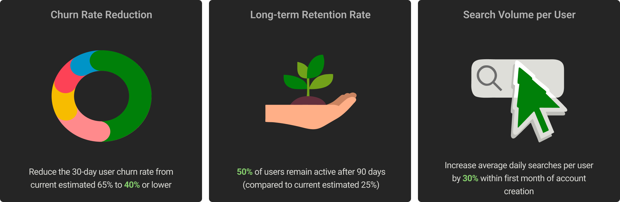
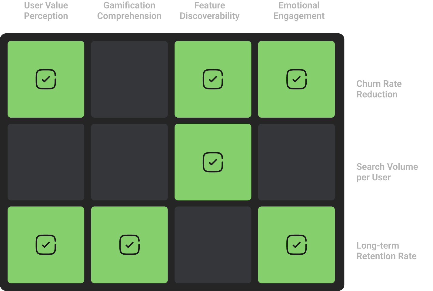
I identified three main KPIs that align with their environmental mission: Churn Rate Reduction, Search Volume per User, and Long-term Retention Rate.
For future validation it was important to establish how I'm going to measure success, so it was important to carpture all posible data types:
- Gamification Comprehension ( Nominal data; aim >= 90%)
- Emotional Engagement (Ordinal data; aim >= 80%)
- Feature Discoverability (Ratio data; aim >= 95% find key features within 60 seconds)
- User Value Perception (Interval data; aim >= 85% rate impact tracking as "very valuable")
Data Discrepancies
🧩 Initially, I treated Emotional Connection and Gamification Comprehension as separate metrics. However, I realized the data markers were misaligned. Comprehension should have been nominal data, while appeal required ordinal measurements. This led me to merge them into Emotional Engagement, allowing for accurate data collection through user-reported emotional connections and engagement with the gamified system.
02. Design Response

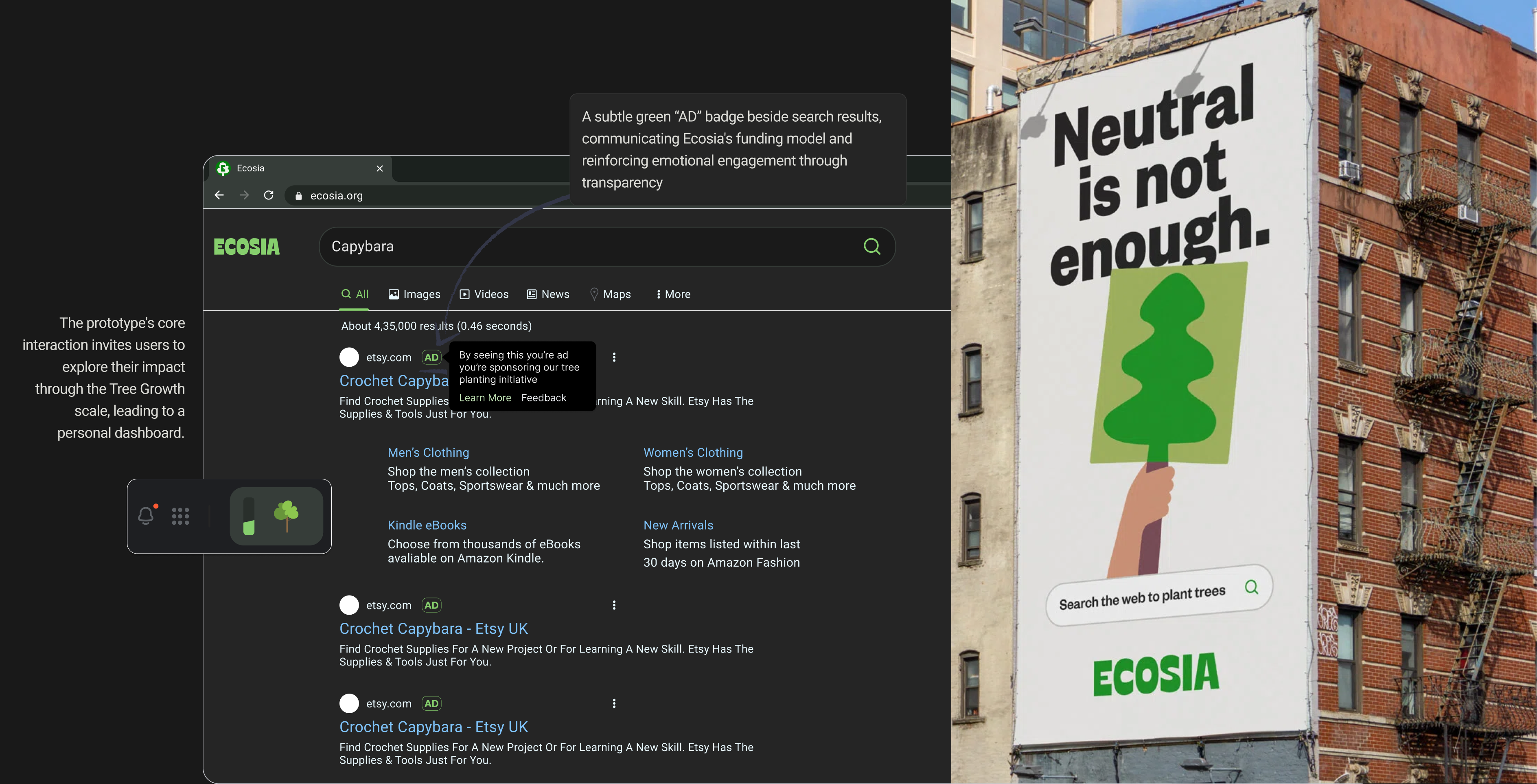
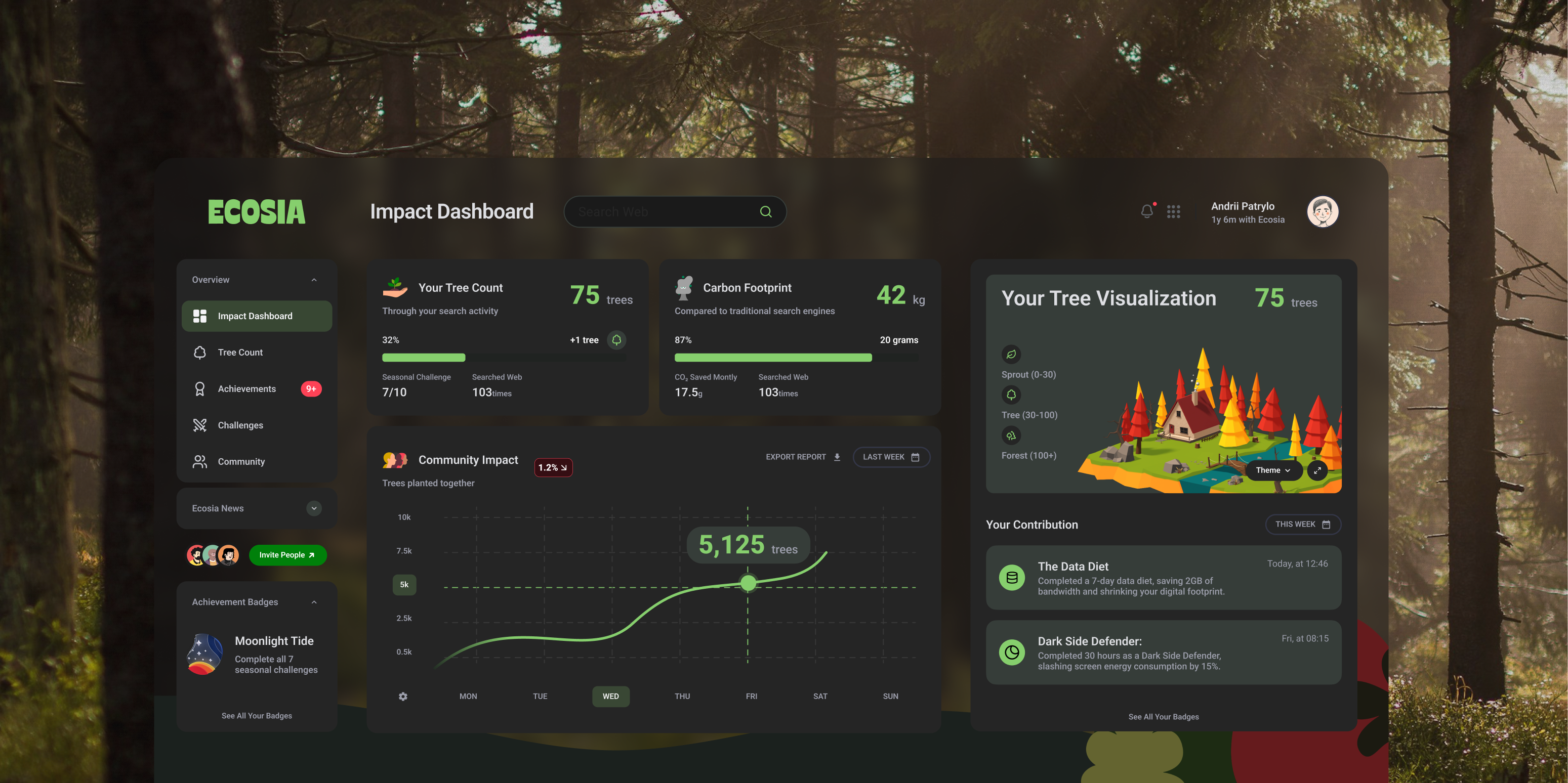
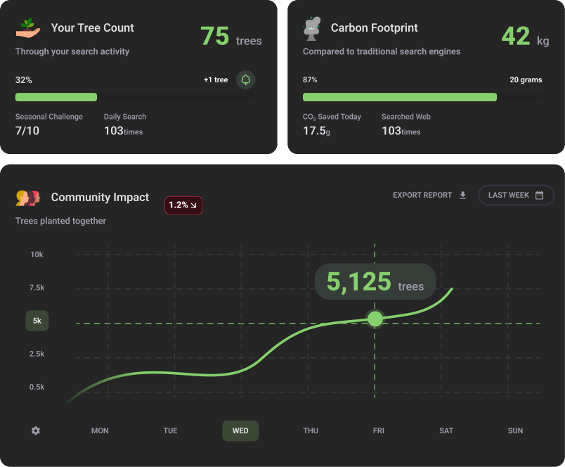
Reflection guided every decision. Rather than introducing arbitrary “points” or “levels,” I focused on authentic motivators like personal growth and contribution. The dashboard translated abstract data into relatable cues: growing a digital forest, earning achievement badges, and tracking CO₂ savings compared to mainstream engines. Key design components included:
- Tree Visualization — an evolving 3D island metaphor representing trees planted through searches.
- Achievement System — challenges and milestones reinforcing consistency and community effort.
- Sustainability by Design — dark mode by default and optimized assets, reducing energy use by up to 60% on OLED displays.

03. Testing and Analysing
“It’s really sweet and wholesome — I can see what my searches are doing,” one participant remarked, capturing the desired affective response.
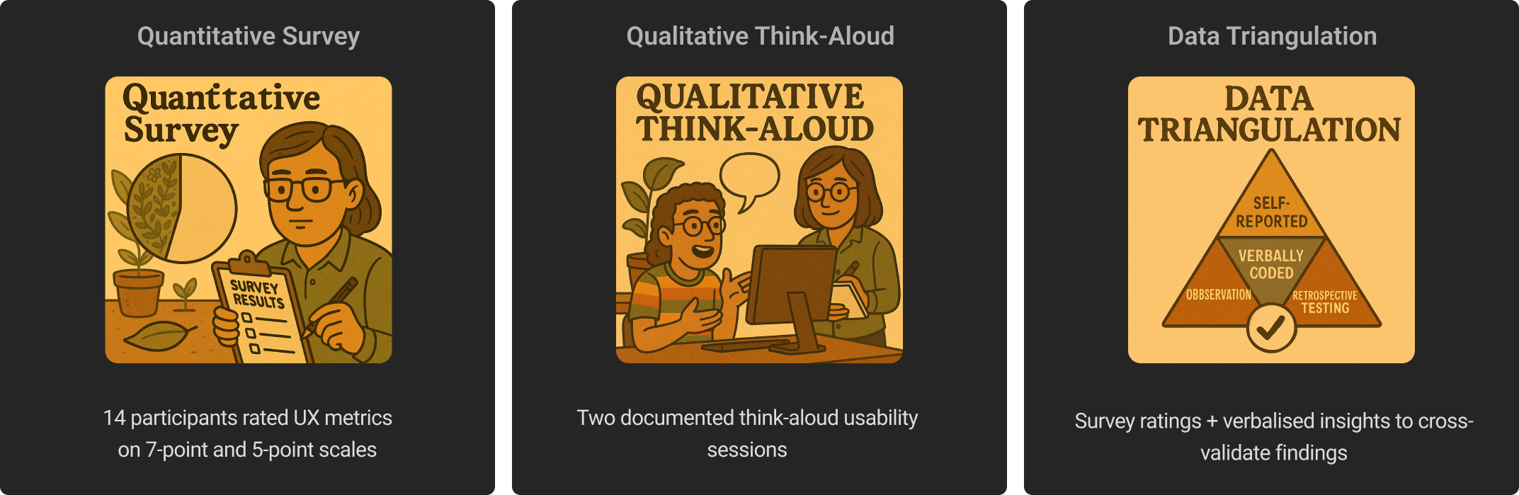
Data collecting Methods
Once the prototype was complete, I conducted mixed-method user testing to validate both usability and emotional impact.
- Quantitative: surveys with 14 participants measured satisfaction and comprehension using 5- and 7-point scales.
- Qualitative: think-aloud sessions with 5 users captured spontaneous reactions and emotional responses.
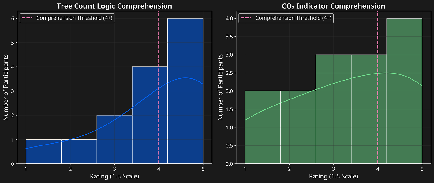
Across all groups, the strongest emotional reactions occurred when users saw their forest grow — confirming that visualization was the primary driver of engagement. However, comprehension issues around impact metrics showed that clarity was as crucial as creativity.
Data-Driven Insights
The findings confirmed my initial hypothesis: users engage longer when impact is visible, intuitive, and emotionally resonant. I learned that reducing cognitive friction (simplifying impact metrics and terminology) directly improves emotional connection and intent to return.

🧪 Interval data since each point represents equal increments, allowing for calculation of averages.
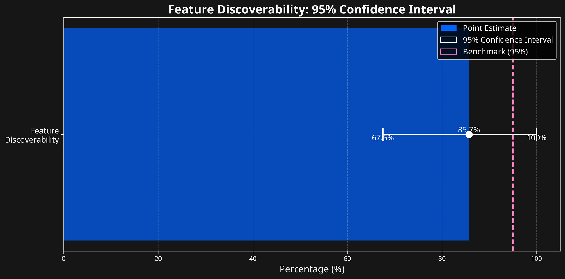
🧪 Ratio data since time measurements have a true zero point and can be compared proportionally (60 seconds is twice as long as 30 seconds).
🧪 Nominal data since it categorises user responses into distinct groups without ranking or measuring the degree of understanding.
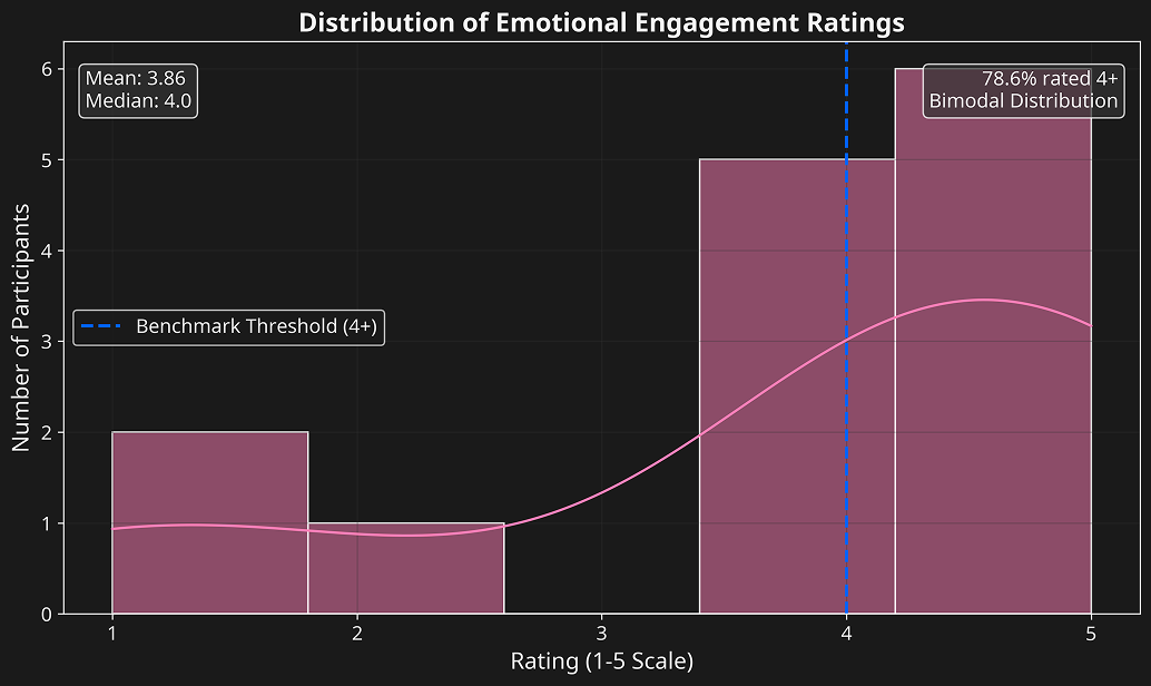
🧪 Ordinal data since emotional responses can be ranked by intensity but lack equal intervals between levels.
04. Outcome & Final Reflection
When purpose is made visible, engagement becomes sustainable — for both the user and the business.
The Ecosia Impact Dashboard revealed how translating environmental metrics into personalized visual feedback can meaningfully improve user engagement. While not every benchmark was met, the project provided critical insight into balancing sustainability goals with intuitive product design.
This project strengthened my belief that sustainable technology design thrives on adaptability, iteration, and data-informed empathy. Each challenge refined my approach as a product designer who aligns user motivation with measurable business outcomes.