Physitrack Group IR
Redesigning Physitrack Group’s Investor Relations website to make financial information easier to access, faster to interpret, and more aligned with investor expectations.
In 2025, I redesigned Physitrack Group’s IR site to better serve how investors work: locating quarterly results, reviewing filings, tracking share-price performance, and understanding segment contribution. I rebuilt the architecture around those tasks, clarified the Lifecare and Wellness model, and designed a faster, more credible way for analysts to retrieve the information they rely on.
01. Understanding the problem
⚠️ All examples, findings, and visuals reference publicly available information or reconstructed design concepts. No confidential or non-public data is disclosed.

— Jakob Nielsen
The first week focused on clarity: what investors actually need when they land on an IR site. They look for recent results, filings, governance, events, and a clean view of how the business divisions contribute to performance.
The current site buried those essentials. My goal was to rebuild the experience around investor workflows, not internal structures.

Information Architecture Overhaul
The original sitemap was shallow and unstructured — essentially a list of isolated pages with no hierarchy, unclear grouping, and no logical pathway for investors to reach filings, reports, governance, or business segmentation. Critical information was scattered across multiple unrelated pages, creating unnecessary cognitive load.
ORIGINAL IA (Legacy Structure)
==============================

Home
│
├── Investor information
├── About
├── Governance
├── Media
├── Spotlight videos
├── Reports presentations
├── IPO
├── IPO access denied
└── Sitemap

NOTES:
- Flat, unstructured navigation
- No grouping or hierarchy
- Critical investor workflows hidden
- Pages function as isolated endpoints
- High cognitive load for analysts
The redesigned IA expands significantly in breadth and logic, introducing clear top-level categories, predictable navigation, and a retrieval-first structure built around investor behavior. While the complete IA is too broad to show meaningfully in this format (40+ pages across eight logical clusters), the simplified top-level view reveals the shift: from a flat list of pages to a coherent, investor-centric ecosystem.
RE-ARCHITECTED IA (Top-Level Overview)
======================================

Home (IR Hub)
│
├── Corporate Overview
├── Timeline
├── Diversity & Inclusion
├── ESG
│
├── Founders & Management
├── Corporate Governance
├── Board Members
├── Articles of Association       ← Corporate constitution
├── General Meetings
├── Director Appointment & Removal
├── Nomination Committee
├── Auditors
│
├── Products                      ← Lifecare · Wellness · Triage
├── Leadership Profiles
│
├── Invest in Physitrack
├── The Share                     ← Ticker · ISIN · Listing data
├── Reports                       ← Annual & interim filings
├── Financial Calendar            ← Earnings · AGMs · events
├── Financial Targets             ← EBITDA · revenue · dividend policy
├── Ownership Structure           ← Shareholding breakdown
│
├── Press Releases
├── Physitrack Spotlight
├── Media Kit
└── Investor School               ← Educational content for investors


ANNOTATIONS:
-----------
- Structure now follows *investor workflows* rather than internal org chart.
- Clear grouping into: Narrative · Financials · Governance · Stakeholders · Media.
- Predictable, retrieval-first design (2–3 clicks to any critical document).
- Supports dual business model: Lifecare (SaaS) & Wellness (Corporate wellness).
- Scalable: new filings, pages, and content types can be slotted without redesign.
02. Parallel Development and Content Population
Design-to-development execution
With structure approved, I moved into execution. Development and content population ran in parallel to maintain momentum under the four-week timeline.
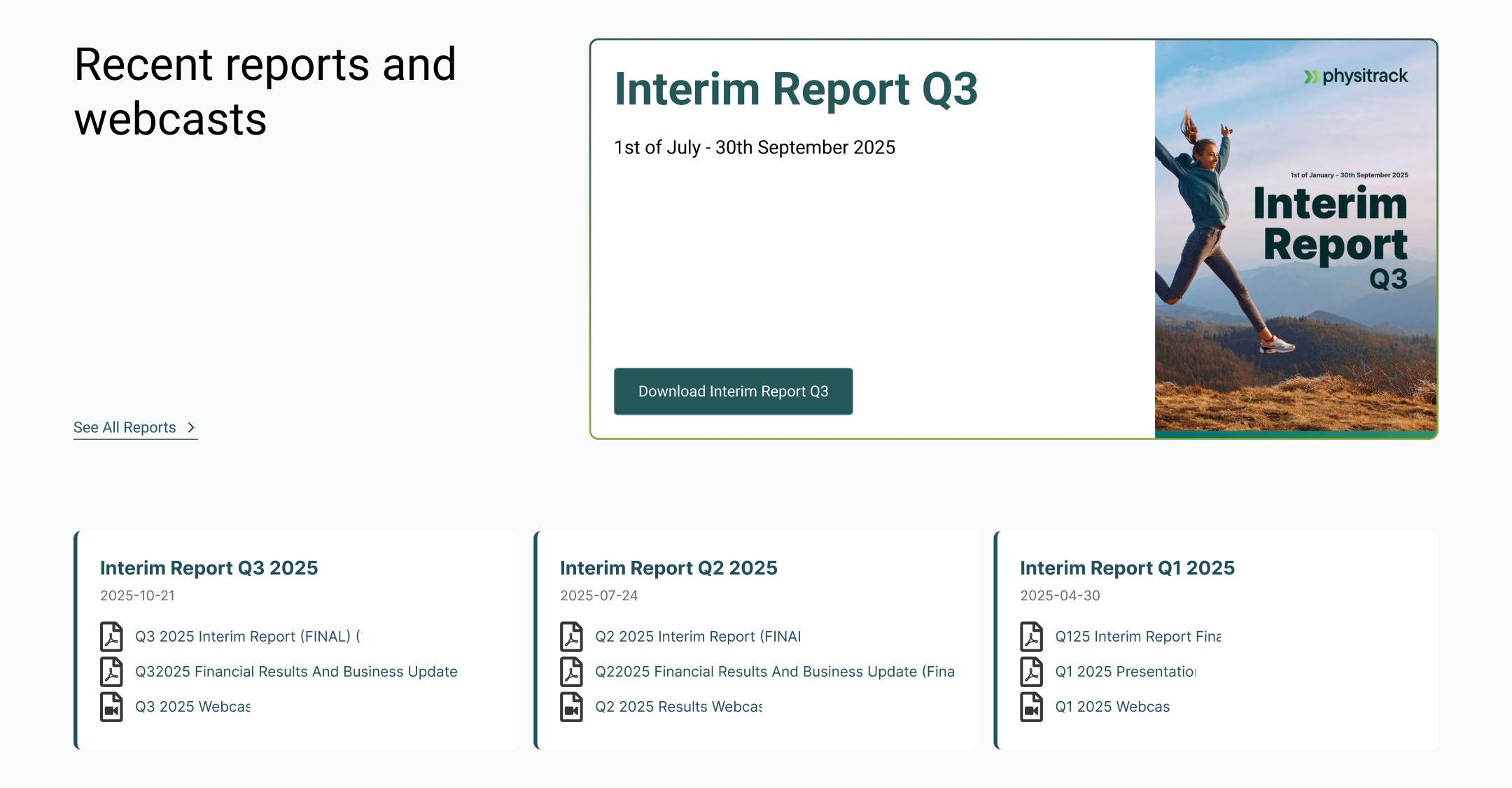
I built modular templates for reports, news, governance, and financial content so updates wouldn’t require redesign.

Cleaning and standardizing the content
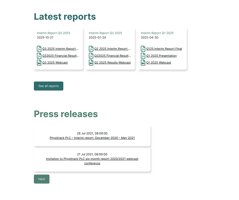
The primary challenge was not the interface but the inconsistency in content. PDFs varied in quality, naming conventions were inconsistent, and the narrative between Lifecare and Wellness lacked cohesion. To address this, I clarified the group structure to enhance understanding of the business model. I restructured file formats, updated document metadata, and established consistent patterns for reports and governance materials, which made the site feel authoritative and reliable.


03. UAT, Bug Fixing, and Go-Live
User Acceptance Testing focused on finding the latest results, checking filings, exploring governance, and scanning recent releases.
This surfaced issues in navigation logic, PDF previews, and widget formatting. Fixing these tightened the experience.
The final days were spent refining details: link validation, visual alignment, metadata corrections, accessibility improvements, and load-time optimizations.
The IR site isn’t meant to impress visually — it’s meant to be invisible. By the end of the week, it behaved exactly that way.
