Digital World
A portfolio redesign that reframed my identity as a systems-minded product designer—balancing business clarity, UX craft, and technical depth.
I redesigned my portfolio to position myself as a product designer who can think in systems, bridge UX and engineering, and communicate business value with clarity. Investors look for evidence of conviction; recruiters look for credibility and coherence. This project brings those needs together through a structured identity, scalable content architecture, and a design language rooted in precision, pragmatism, and technical fluency.
1. Introduction to the portfolio project
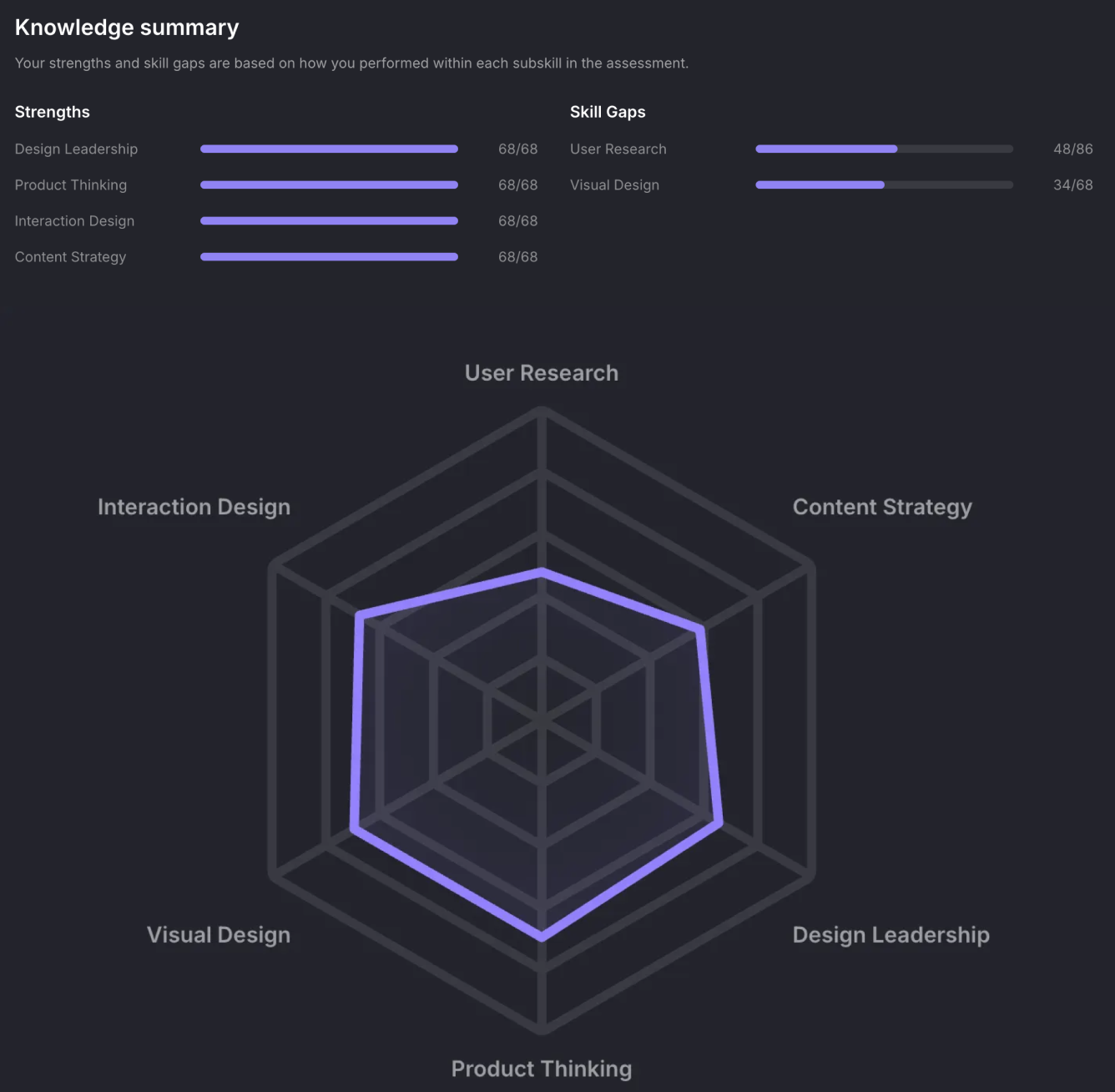
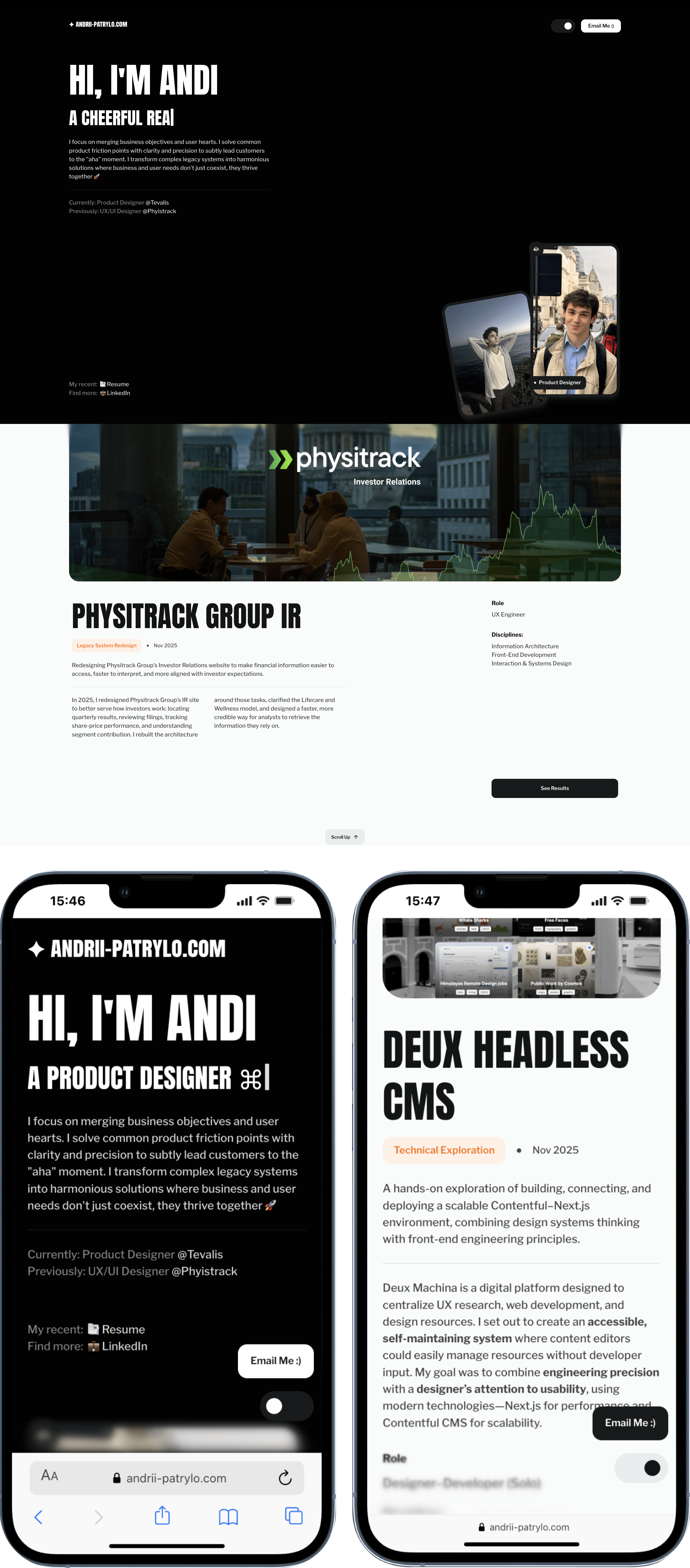
My portfolio presents me as a B2B/SaaS product designer with a computer science foundation and strengths in systems design, content strategy, and technical problem‑solving. It is aimed at roles in small, cross‑functional teams where a designer is expected to think in products, not just screens. I wanted to show that I am a reliable, credible professional, but also a human with clear values and ways of working. A Uxcel UX Design Skill Mapping (fig. 1.1) helped me identify strengths and gaps and confirmed my positioning as a versatile “one‑person army” who can connect business goals, user needs, and implementation detail.
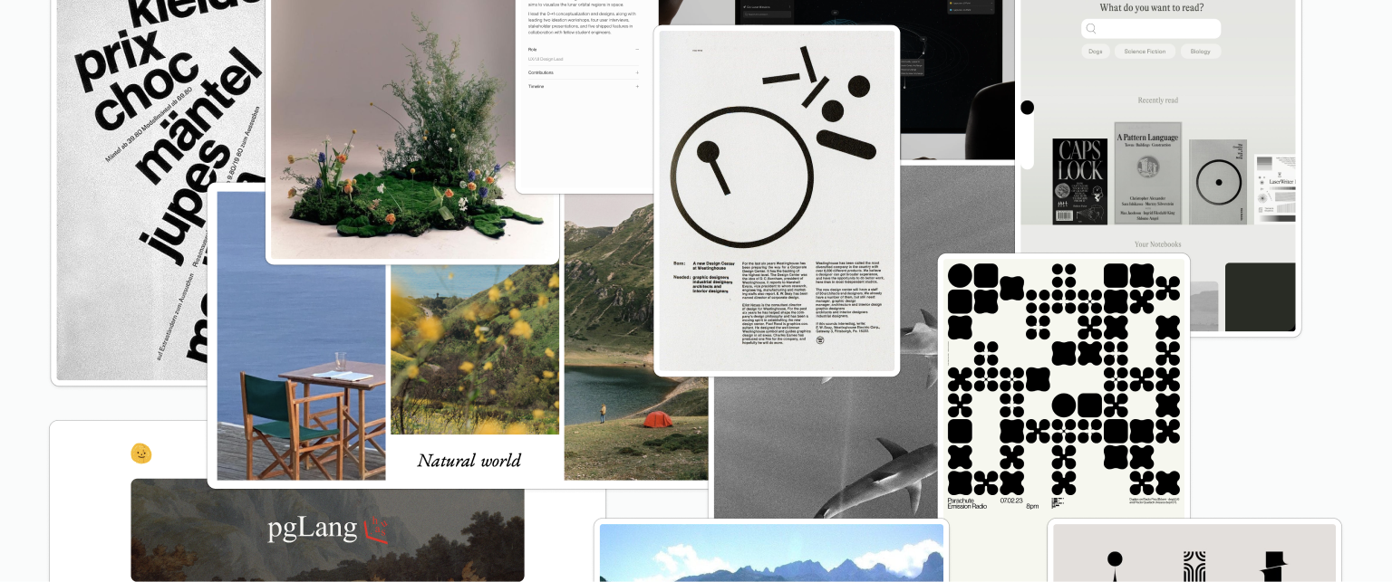
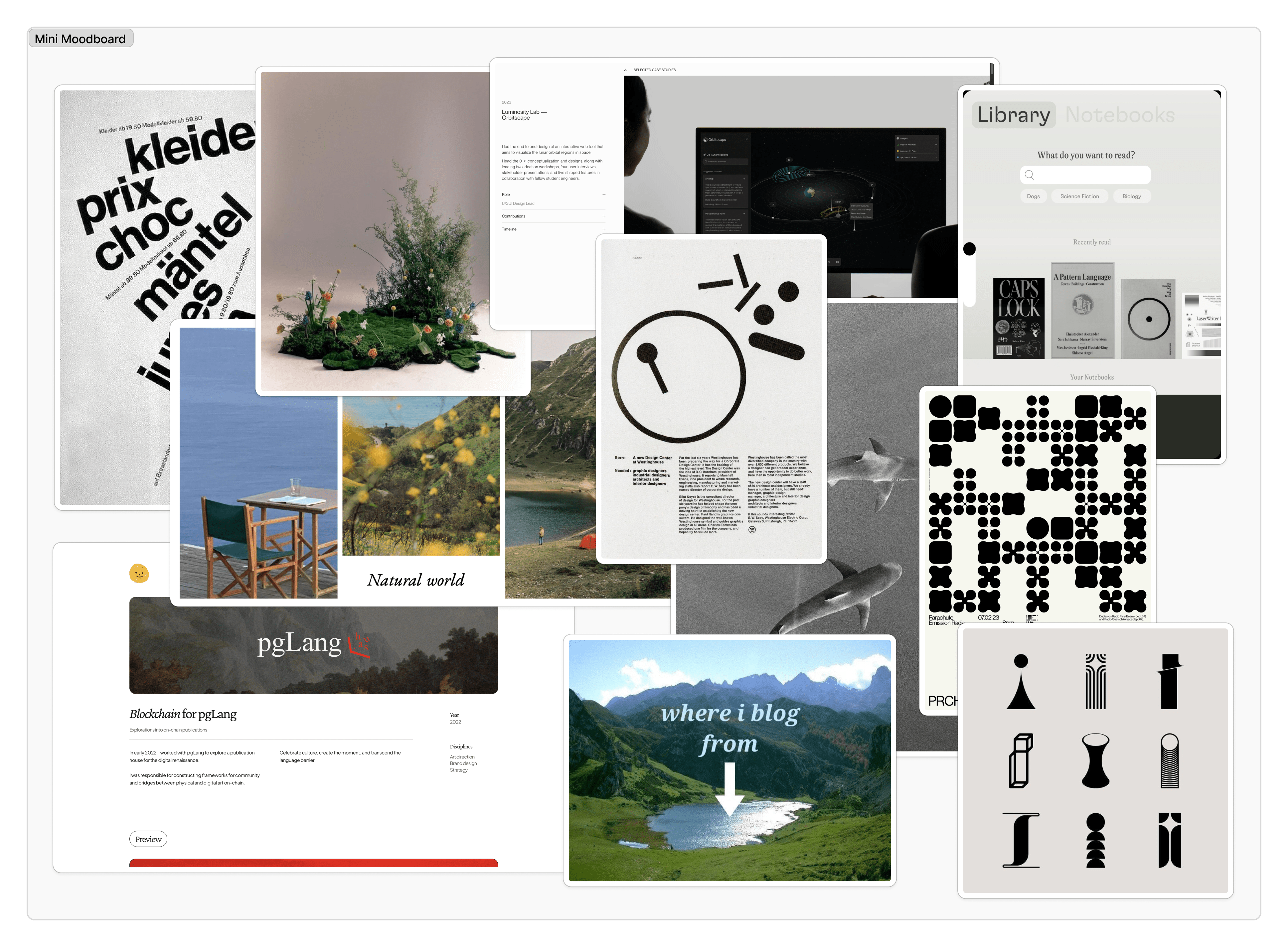
2. Moodboard and portfolio inspiration
I developed a confident, organised visual direction inspired by Swiss typography and personal journals (fig. 2.1)—a kind of letterpress manifesto for a modern product designer. The approach is simple, with strong grids and restrained colour. I also drew inspiration from industry peers: Bradley Ziffer’s tactile digital interfaces, Jordan Hughes’s content‑driven systems (Untitled UI), and Jony Ive’s (fig. 2.2) idea of “inevitable” design. Together, these influences support how I want to be seen: pragmatic, systematic, and thoughtful rather than purely decorative.

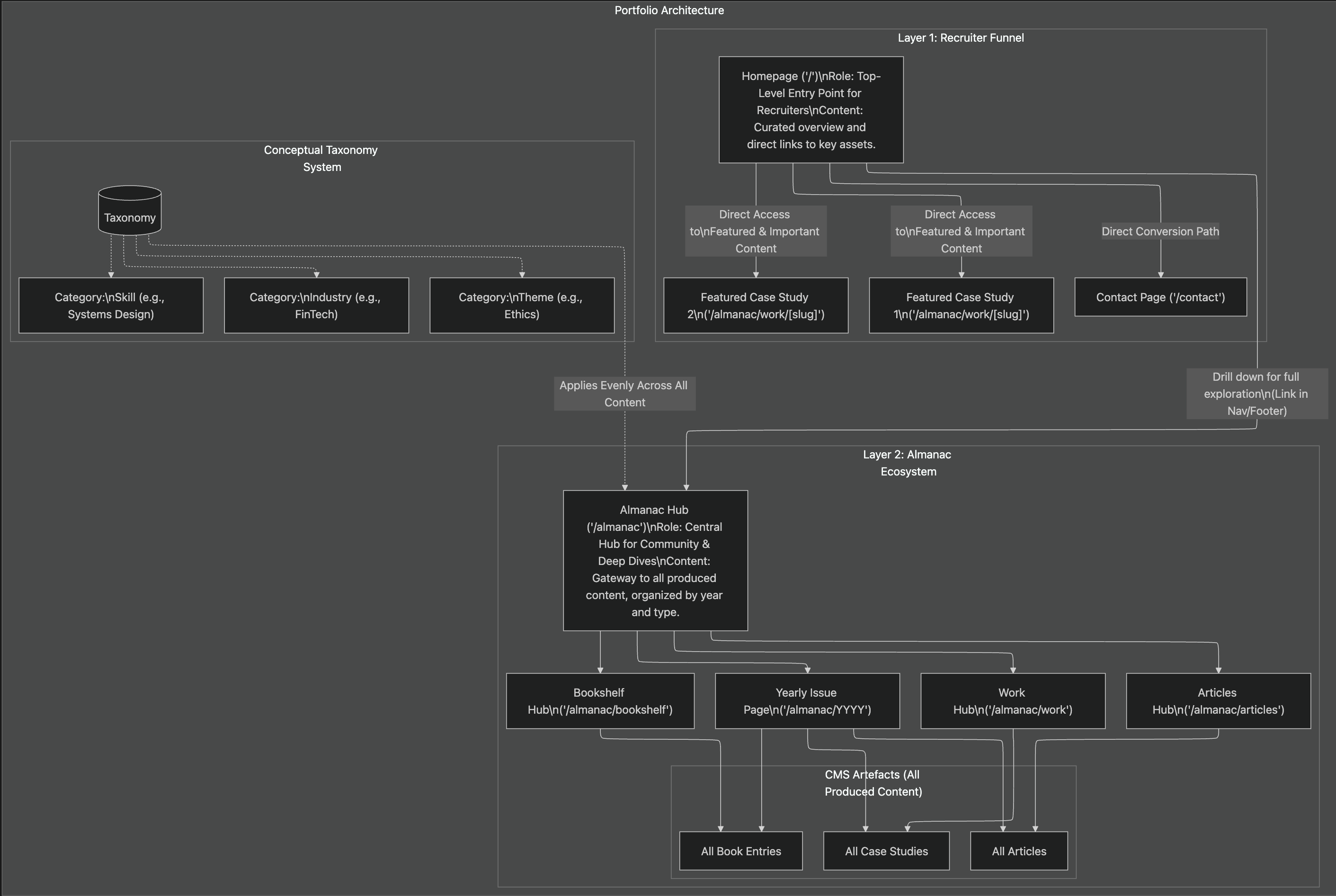
3. Vision and process reflection
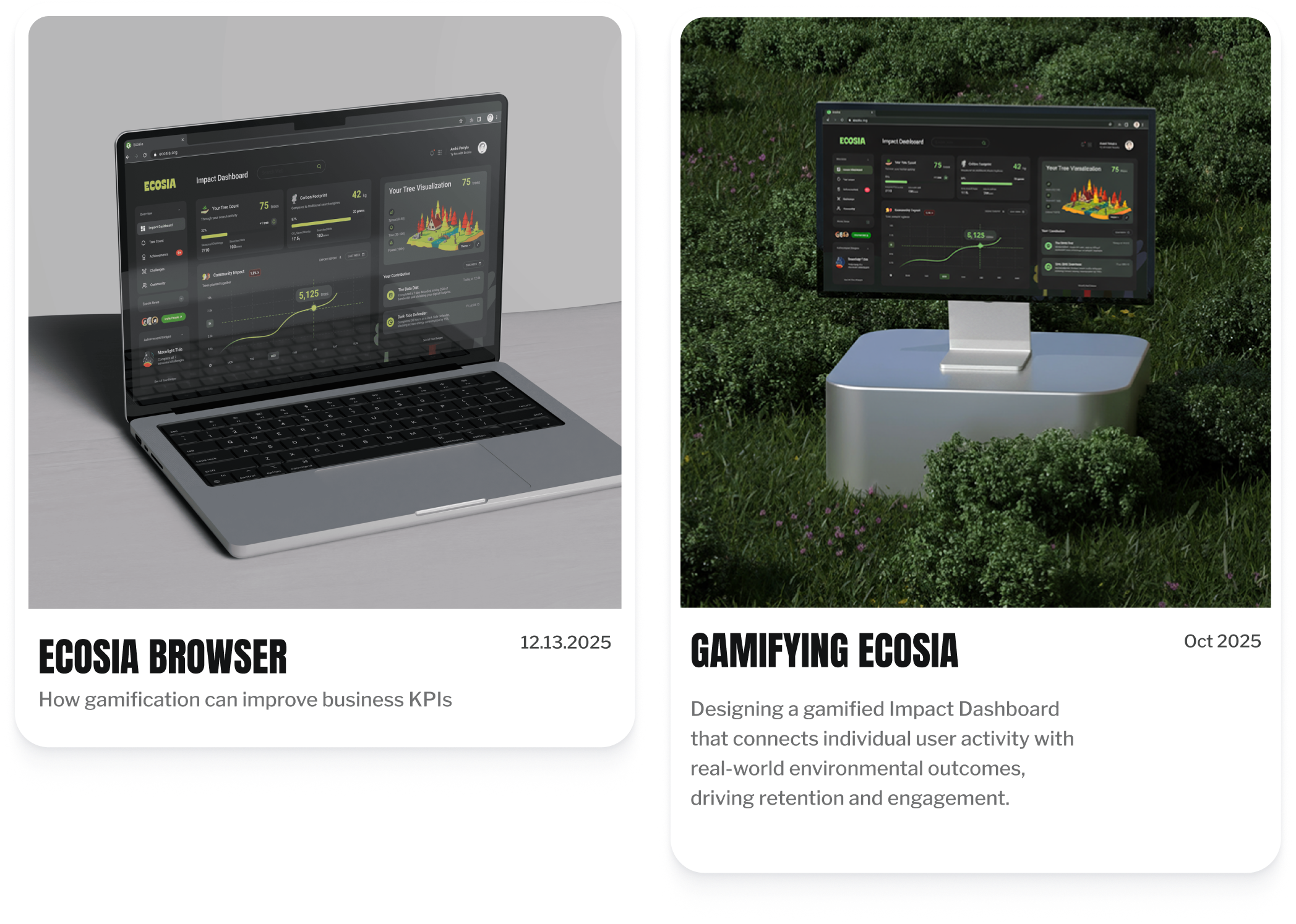
This project was an exploratory exercise rather than a strict design‑thinking sequence. After several iterations, I defined a broader “Almanac” concept—a yearly professional journal beyond a standard portfolio. Drawing on Edmiston’s (2014) argument that online presence should create competitive advantage through engaging content, I initially planned a rich ecosystem of work, articles, and reading notes (fig. 3.1). However, this exceeded MVP scope, so I pivoted to a focused “Recruiter’s Handshake”: a clear value statement, four strong case studies, and simple navigation that can scale into the Almanac over time.
4. Choice of tool and template comparison
I chose Webflow for its CMS and multi‑reference fields, which let me model content as interconnected artefacts (fig. 4.1) rather than static pages. Webflow also supports technologies like MCP and AEO, which offers valuable future‑proofing beyond this project’s immediate needs. I started from a lightweight starter layout rather than a full portfolio template, then re‑structured the navigation, CMS schema, and visual system so the final result reflects my own architecture and “digital humanist” style. I used Relume to rapidly prototype wireframes (fig. 4.2), which allowed me to test flows and content hierarchy before committing to visual detail.
5. Early sketches and work‑in‑progress
The first design attempt directly reflected the moodboard and Almanac concept. I began with sketches and low‑fidelity layouts that explored denser editorial pages, heavy typographic hierarchy, and more expressive imagery. Although I liked this direction, industry peers felt it was too conceptual for someone early in their career. In response, I made the practical decision to simplify: a mostly black‑and‑white palette, clearer hierarchy, and more conventional layout patterns that still align with the original digital humanist concept.
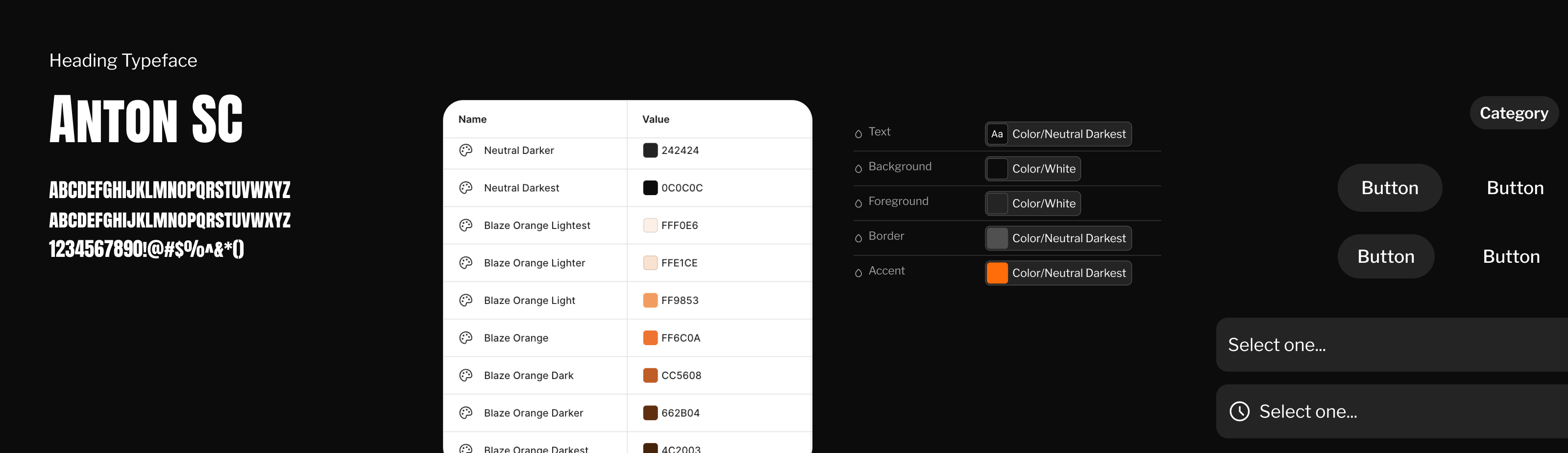
6. Design styleguide and development from moodboard
The styleguide translates my moodboard into rules. I use a strict grid and a neo‑grotesque typeface to communicate rigour and clarity, but layer in subtle texture, angled photography and conversational microcopy to avoid a cold, corporate feel. This “digital humanist” approach is a deliberate response to generic, highly polished portfolio aesthetics.
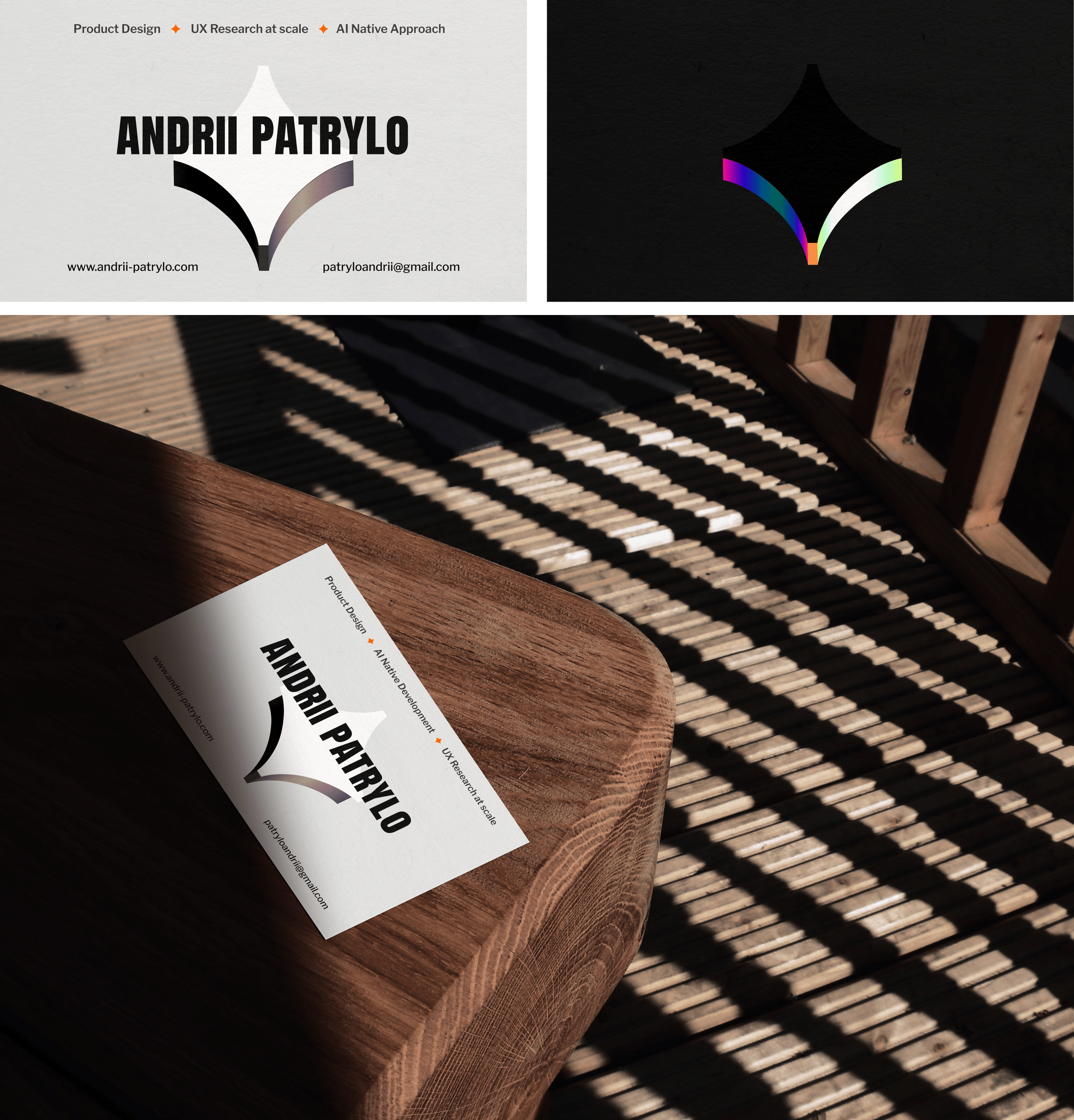
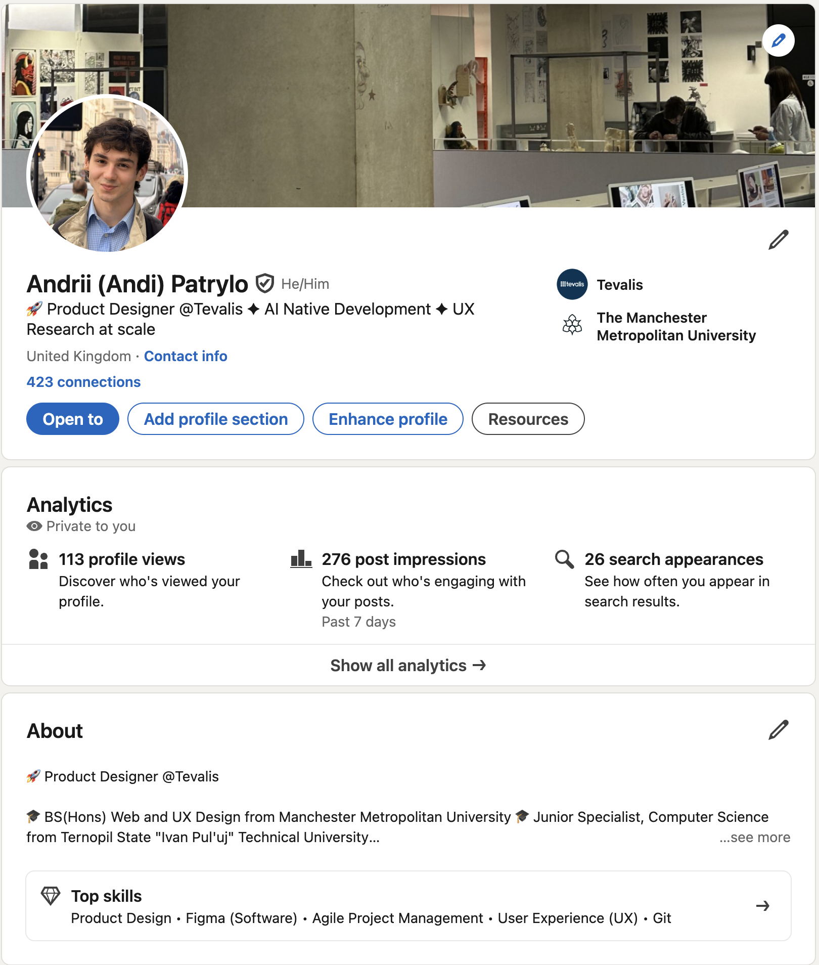
Once the direction was clear, I extended the visual system to physical artefacts—primarily business cards—that reinforced my identity and specialist positioning.
7. Anonymised feedback and reflection
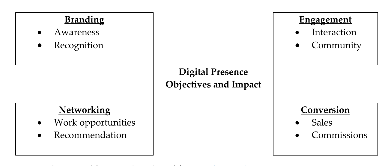
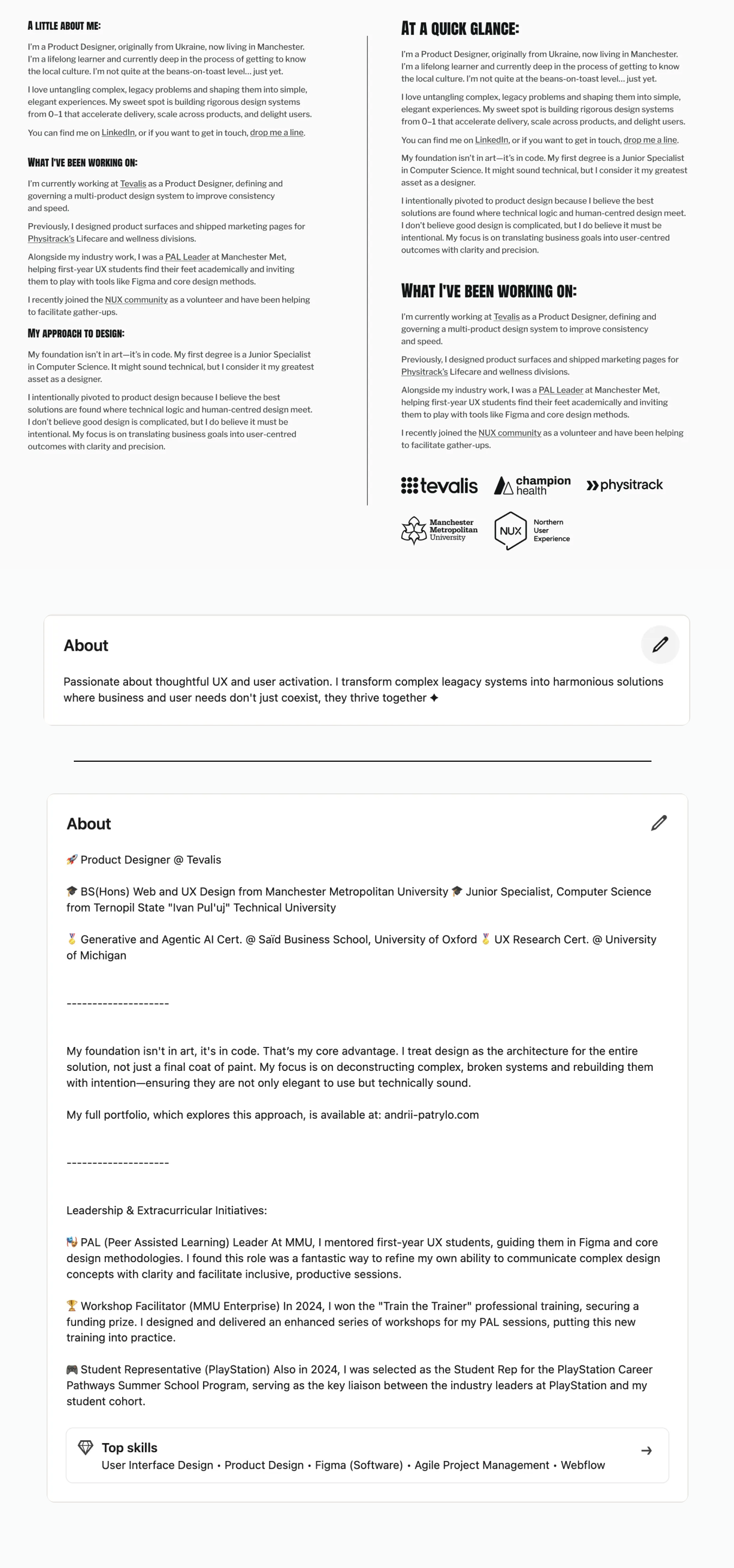
Peer and professional feedback provided concrete insights into how my portfolio was being interpreted. Drawing on Petrides and Vila de Brito's (2024) framework of branding, engagement, networking, and conversion (fig. 7.1), I identified specific gaps in my self-presentation. For instance, one reviewer pointed out that my "About" section underplayed my technical background and mentoring work—both central to my positioning as a versatile generalist. This prompted revisions across both my portfolio and LinkedIn to better surface these capabilities.
Separately, Yi-Hsuan Lin's talk "What No One Tells You About Your First Design Job" reinforced a structured feedback loop—start with context, align on goals, then be explicit about the type of work you're presenting. Applying that framework, I replaced abstract project titles with straightforward descriptors that clearly communicate project type and scope at a glance.
I also used generative AI tools to rephrase and compress copy during later iterations, treating them as assistants rather than authors and ensuring that final decisions and narrative structure remained my own.
8. Final outcomes and changes after feedback
The final outcome is a responsive portfolio that functions as a clear “Recruiter’s Handshake” while quietly seeding the longer‑term Almanac vision. I extended the visual system to LinkedIn and business cards so the same voice and visuals carry across touchpoints. Revisions to the About section, case study labelling, and homepage copy directly support conversion, networking, and sustained engagement (Petrides and Vila de Brito, 2024). Next, I plan to develop the Almanac hub once the core portfolio has time to perform with recruiters, adding deeper case studies and writing without compromising the clarity of the initial experience.
Edmiston, D. (2014) ‘Creating a personal competitive advantage by developing a professional online presence’, Marketing Education Review, 24(1), pp. 21–24. Available at: https://doi.org/10.2753/MER1052-8008240103 (Accessed: 5 November 2025).
Petrides, L. and Vila de Brito, M. (2024) ‘The impact of digital presence on the careers of emerging visual artists’, Social Sciences, 13(6), p. 313. Available at: https://doi.org/10.3390/socsci13060313 (Accessed: 5 November 2025).
OpenAI (2025) GPT-5.1 [Large language model]. Available at: https://openai.com